Nombolo For Business | Listing Experience
What Got in the Way?
Lacking Guidance to Onboard Merchants
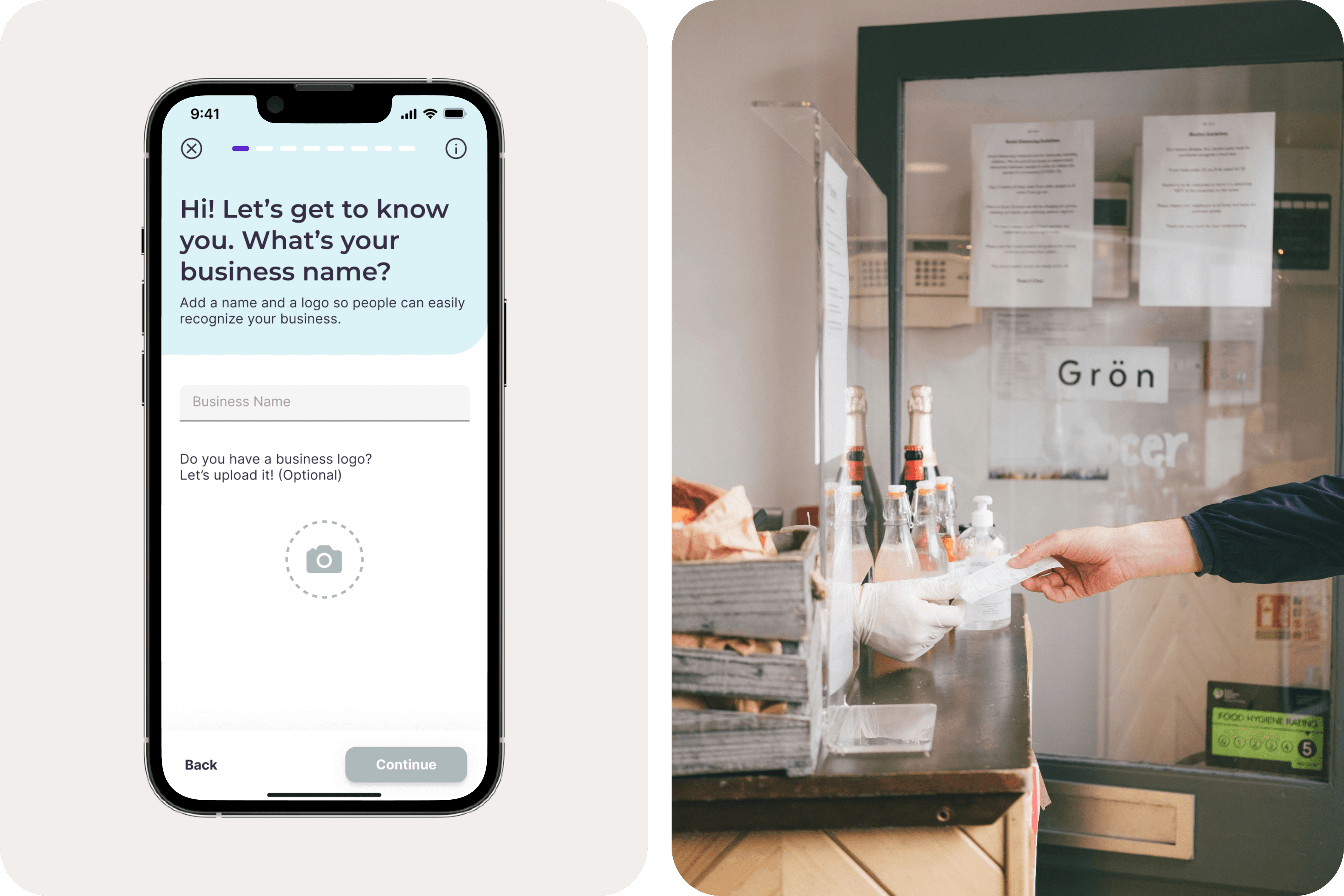
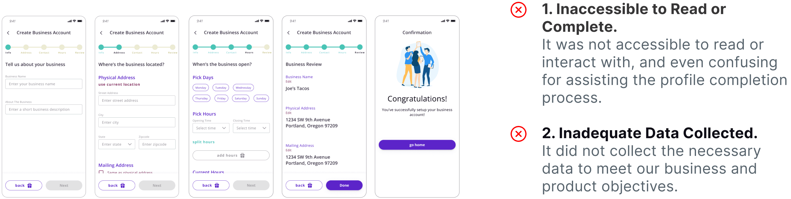
Previously, when listing business, merchants were like filling out a tax form.
Despite only a few small steps, I noticed a low accessibility in UI and zero guidance and user considerations in UX.
This resulted in many merchants abandoning the process within only a few taps.
Whom did I design For?
Small Business Owners
Although many small merchants have great products to offer, with low-to-zero budgets, they shy away from utilizing marketing to grow business.

Therefore, Nombolo invites local small business owners to list their business profile on the platform to interact with their customers digitally via video-sharing.
User Research
Dive deeper into the needs of merchants and customers
At first, the best way to improve this experience was in myth.
Many questions were in my mind. What information must merchants fill out? What information would customers want to know about? …
Due to the lack of pre-existing insights and metrics, I formulated a user research plan to explore more... Read Full UX Research Doc here ↗️.

UXR doc screenshot
The key takeaways boil down to:

Small Merchants
Small merchants who decided to start their own business are often influenced by their own cultures and hobbies, which could be an opportunity to differentiate our platform.
Customers
Customers tend to rely on visuals, such as images of food, to decide which businesses to visit, indicating photos are necessary. Instead, reviews are considered as a reference, but not a definitive factor since individual tastes vary greatly.

Defining the User Flow with Research Insights
Thus, we could create a more engaging business profile to attract customers in the process.

Onboarding Task flow
tension in the design ideas
One Pager vs. Step-by-step
When designing the general layout, I proposed a step-by-step approach - a progressive disclosure pattern to minimize user intimidation.
However, a teammate advocated for a single-page form to reduce interaction cost.
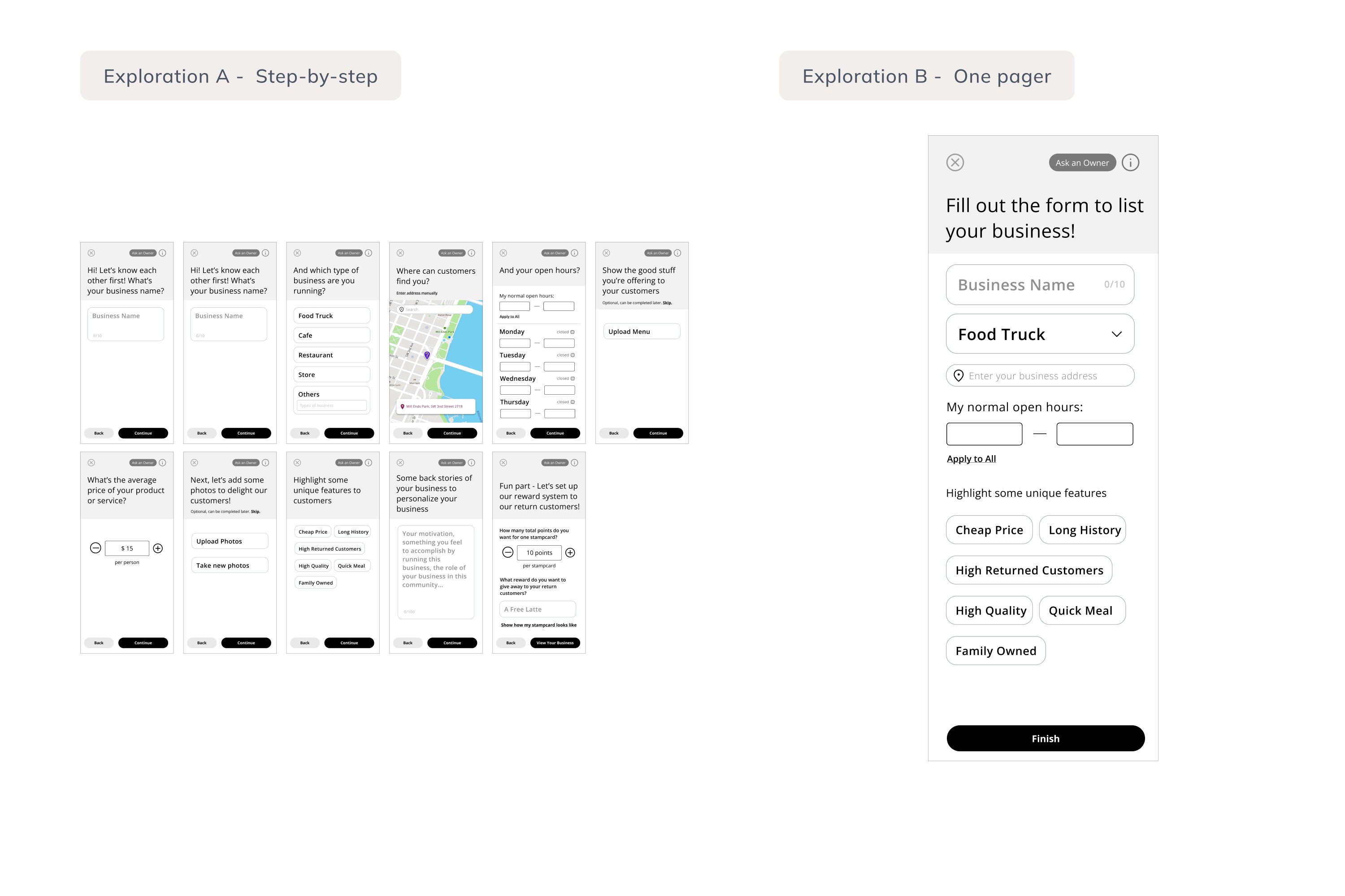
Different design explorations
Through collaborative design presentations and votings, the team opted for the step-by-step flow because it:
Less Overwhelming for users;
More Familiar to Interact in the current existing apps;
Less Risk of Data Loss.
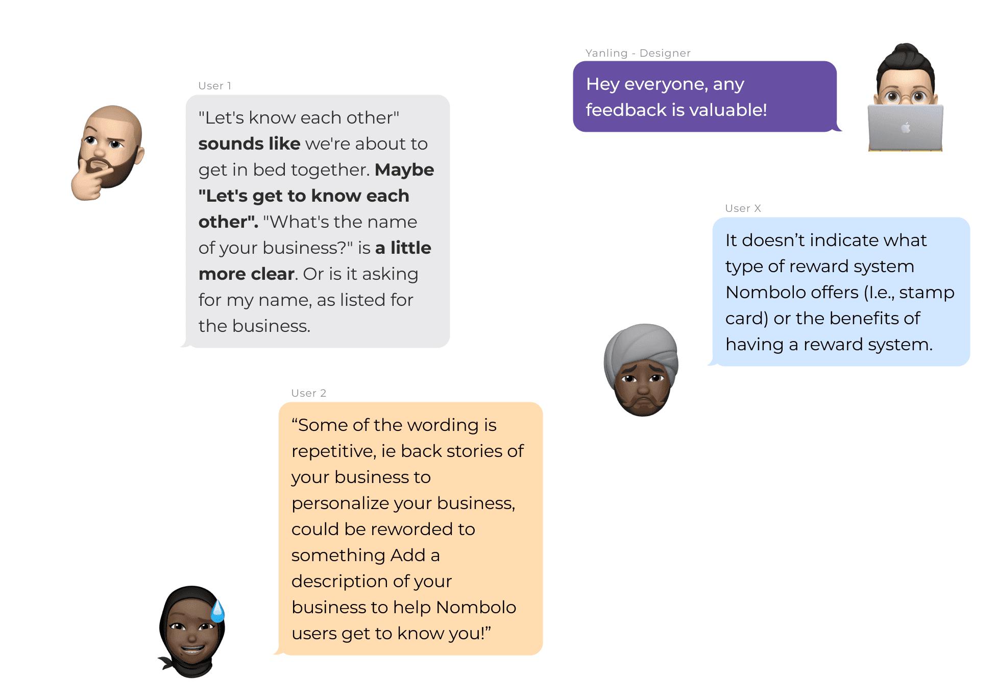
What User Testing taught us?
UX writing issues stood out.
Then, we conducted a rapid user testing within the internal team: the phrasing of the inquiries became the main complaints of being unclear or inappropriate. After analyzing all the feedback, we revised the copywriting notably following three design principles:
Be Accessible
Since many of our targeted users are non-native English speakers, we must be mindful of the potential difficulties posed by the language barrier.
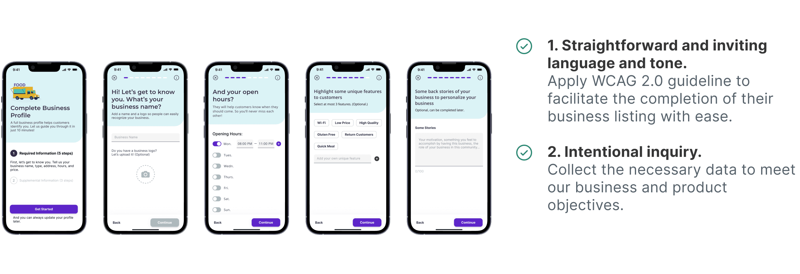
Be Straightforward
Consequently, we aimed to employ most straightforward and inviting language and tone. Plus, limiting by screen size, we had to cut number of words to minimum.
Be Helpful
At some contexts, users might wonder: why is this question relatable? or what if I skip this question? Thus, I supplemented each question with a brief description to provide the right amount of additional guidance to facilitate completion.
User Feedbacks
Final Design
A More Streamlined Listing Process with Enhanced Accessibility
The process begins with an overview of all steps, setting clear expectations. Next, users are prompted through each inquiry to fill in profile information. We also optimized accessibility through strong visual contrast and language use.
Before
After
Overall, with the user-centered approach, I delivered a good balance of guidance and freedom, enabling users to easily complete a listing that accurately promote their business.
Communicate with Engineers
Preparing for Handoff
After multiple iterations and team discussions, we finally delivered the design to the Devs team to implement it.
Handoff Guideline
After presenting to the CEO and getting approval, I organized a handoff meeting with developers, communicating design rationales and demonstrating user interactions with hi-fi prototypes.

Other than pushing pixels, I care about design culture as well.
Being the lead, I structured and refined a more efficient UX workflow.
User Research
Before I joined, the company had proceeded relying on assumptions to expedite delivery. Yet, I took the initiative to formulate research plans and reach out to the CEO to connect me with some existing customers as my interviewees.
Validating Solutions
Despite tight timeline, we used Maze to test our proposed designs and improved them before handoff. It largely reduced engineering wastes.
Sprint-based Projects
To ensure we deliver design on time, I broke down each project into 2-week sprint.